Colour plays an important role in how your business and brand is perceived. Whether you’re a fashion brand trying to connect to a youthful audience or a medical supplies store trying to strengthen customer trust, you can study colour meanings to help you better attract and connect to your ideal customer. Read on to understand the colour meanings for the most popular colours used.
Why Colour is So Important
Colour evokes feeling. It incites emotion. And it’s not any different when it comes to selecting colours for your business.
Choosing the right colours for your marketing efforts can be the difference between your brand standing out from the crowd, or blending into it. By using colours strategically for your marketing efforts, we get your audience to see what you want them to see and help them perceive you the way you aim to be perceived.

‘Exciting’ Red
The red colour meaning is associated with excitement, passion, danger, energy, and action. You might’ve noticed that some brands use red for ‘order now’ buttons or for ‘Sale’ banners to stand out. In colour psychology, red is the most intense colour and thus, can provoke the strongest emotions. Red can also trigger danger so you want to use the colour sparingly.
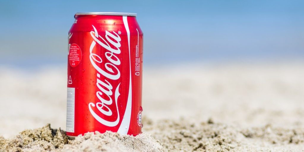
Red is used by Coca Cola and YouTube. The colour red tends to encourage appetite hence why brands like Coca Cola use it. They also use words like happiness in their branding so they use the colour red to build excitement. YouTube likely uses the colour red due to the excitement of watching videos online. Notice how the red part of their logo is the play button which can help compel someone into action. It encourages you to want to press play on their videos.
‘Creative’ Orange
In colour psychology, orange represents creativity, adventure, enthusiasm and value. The colour orange adds a bit of fun to any picture, website, or marketing material it’s on. Despite its attractive colour, it’s not as commanding as the colour red.
Orange’s colour meaning shines through in logos like EasyJet and B&Q. EasyJet’s proposition is based on the concept of value. The widespread use of orange across its marketing stands out similarly to red but stays away from the danger associated with red.
B&Q sells products that you can use for your home. Many DIYers head to B&Q to buy products to renovate their home or make improvements. The orange logo here also represents creativity.
‘Happy’ Yellow
The colour meaning of yellow revolves around sunshine. It evokes feelings of happiness, positivity, optimism, and summer but can also be associated with warning. Some brands choose to use a cheerful yellow colour as the background or border for their website design. We often use yellow for ‘free shipping’ bars at the top of websites if it matches the rest of the website’s scheme. A little touch of yellow can help your website visitors associate your store with something positive.
The colour yellow is used heavily by Ikea. What does buying furniture have to do with happiness? Well, let’s look at who’s likely buying those products. Many people who’ve just bought their first home or are moving out for the first time, will head to Ikea to buy products to furnish their homes. This milestone is usually filled with happiness and optimism for the new change, making yellow a great colour to associate with the brand.

‘Natural’ Green
In colour psychology, green is highly connected to nature. Growth, fertility, health, and generosity are some of the positive colour meanings of the colour. The colour meaning for green also carries some negative associations such as envy. If our clients are in the health or fitness industries, we often choose to add more green to websites and marketing materials. For example, on homepage banner images, menus or call-to-action buttons.
The use of green is made popular by brands such as John Deere and Roots. John Deere’s entire brand revolves around nature. Their product line centres around landscaping, agriculture, lawn care equipment and more. The colour green is so ingrained into their branding that even their equipment is the same shade of green as their logo. That way, when someone sees that product, they’ll immediately know it’s a John Deere.
Roots is a fashion retailer. However, when browsing their banner images and marketing materials, you’ll often find their models in natural outdoor settings. The green logo blends well with their nature imagery helping them attract outdoor enthusiasts as their target market. So even if your products don’t necessarily tie to a niche, you can use colour to help you attract a specific demographic.
‘Dependable’ Blue
Blue’s colour meaning ties closely to the sea and the sky. Stability, harmony, peace, calm and trust are just some of the feelings your customer may feel about your brand when you integrate the colour blue into your branding. Conversely, blue can also carry some negative colour meanings such as depression and can bring about a sense of coldness. We often use a complementary or contrasting blue on a website’s top navigation. Some retailers add their guarantee, trust certification or free shipping icons in a blue colour to strengthen the notion of dependability for which the colour is known.
Tech brands like Facebook and Twitter use blue in their marketing in their attempts to position the brand as trustworthy and reliable. Another example is Oral B; a dental health brand that sells toothbrushes. Healthcare businesses, like Oral B, typically use blue in their branding to help people associate the business with a quality, reliable and safe service or product.
‘Sophisticated’ Black
Black is a popular colour in retail. In colour psychology, black’s colour meaning is symbolic of mystery, power, elegance, and sophistication. In contrast, the colour meaning can also evoke emotions such as sadness and anger. Many fashion retailers have used black in their logos. Black is also a popular colour for text as it’s an easy colour to read. Some brands choose to use black and white photos for lifestyle banner images or icons to create a certain tone or consistency on their website.
Chanel uses black for their logo and has several black and white images on its website to maintain a consistent high-end look. Once you start browsing their website, a thick black top navigation background appears. Noticeably, their call to actions are also black, which contrast well against a white background.
‘Pure’ White
In colour psychology, white showcases innocence, goodness, cleanliness, and humility. Keep in mind, that this is the meaning in Western culture. In some parts of the world, white has the opposite meaning. so you’ll need to consider the target audience you serve. On an e-commerce website, white tends to be the predominant colour. We often use it as the background colour for product photos, along with a black font. This is because black font on a white background is the best colour combination for readability.
White is a colour used heavily by the online brand ASOS. When the website background is grey or black, the logo and font are white and when the background is white the logo and font are black.

‘Playful’ Pink
Pink is a popular colour for brands that primarily serve a female clientele or talk to a female audience. In colour psychology, pink’s colour meaning revolves around femininity, playfulness, immaturity and love. Some brands have chosen to use the colour pink as the base colour for their website and product packaging, using a black contrast for the notion of sophistication. This works especially well with cosmetics, perfumes and lingerie.
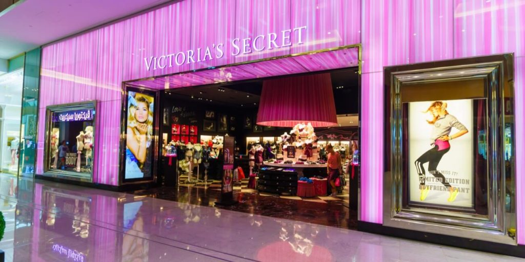
Since the colour meaning for pink includes femininity, it’s no surprise that brands like Victoria’s Secret and Barbie use the colour so heavily. Victoria’s Secret even named one of its brands Pink.


